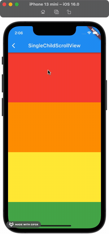
Scrollable Widget
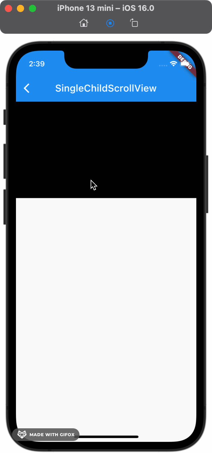
Single Child Scroll View
기본은 스크롤이 안되지만, 화면이 길어지면 Scroll이 가능함.
뷰를 호출할 때 전체 리스트를 한꺼번에 불러온다는 문제점이 있음. 이는 성능 이슈로 이어질 수 있음.
SingleChildScrollView(
  child: Column(
    children:
        rainbowColors.map((e) => RenderColorContainer(color: e)).toList(),
  ),
)
physics: 스크롤 스타일
개체가 화면을 넘어가지 않으면 scroll이 불가능 하지만 이를 억지로 가능하게 해주는 방법도 있음.
SingleChildScrollView(
  /*
    Single Child ScrollView가 어떤 방식으로 작용하는지 정할 수 있음.
    AlwaysScrollableScrollPhysics() - 항상 스크롤 가능
    NeverScrollableScrollPhysics()- 절대 스크롤 불가능
    BouncingScrollPhysics() - iOS Style (튕김.)
    ClampingScrollPhysics() - Android Style (튕기지 않음.)
  */
  physics: AlwaysScrollableScrollPhysics(),
  child: Column(
    children: [
      RenderColorContainer(color: Colors.black),
    ],
  ),
);

PageScroll
말로 설명하자면 어려운데 책장 넘기듯이 다음 페이지로 넘어가게끔 해주는 기능, 중간에 걸리거나 그러지 않고 다음 List로 넘어감.
- 적용 전
적용 후
clipBehavior: 화면 잘림
위에서 보면 화면이 스크롤 될 때 잘리는 것을 볼 수 있음. 이는 clipBehavior 속성을 추가해서 해결할 수 있음.
전체 적용 👇SingleChildScrollView(
physics: AlwaysScrollableScrollPhysics(),
// Clip.none : 화면 잘리지 않게 해줌.
clipBehavior: Clip.none,
child: Column(
children: [
RenderColorContainer(color: Colors.black),
],
),
);
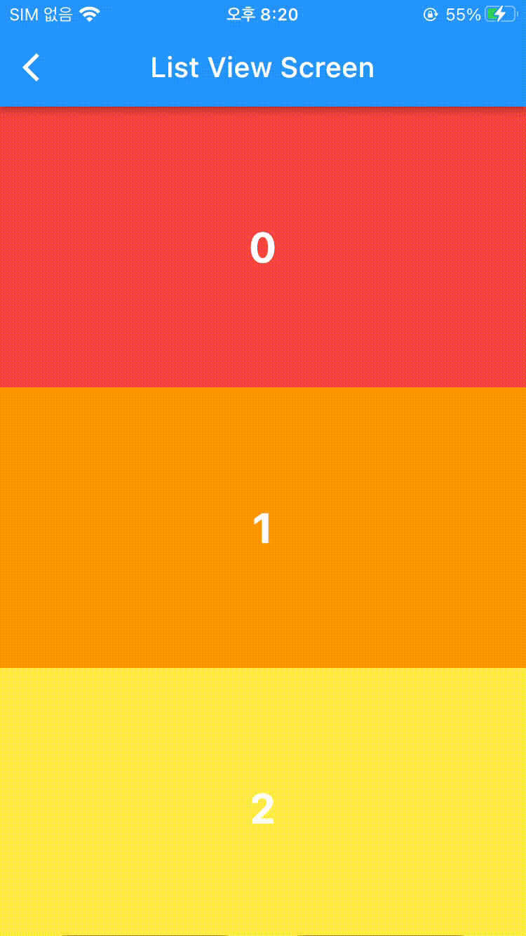
List View
모든 뷰를 한 번에 보여주는 방법, 기본적인 사용 방법이지만 이는 위의 Single Child List View와 같이 성능 이슈로 이어질 가능성이 있음.
Builder: Build되는 View만 생성
Build 되는 View만 생성하므로 성능 이슈 안정화.
ListView.builder(
  itemCount: 100,
  itemBuilder: (context, index) {
    print(index); // 새로운 뷰가 호출될 때마다 생성
    return RenderColorContainer(
      color: rainbowColors[index % rainbowColors.length],
      index: index,
    );
  },
);
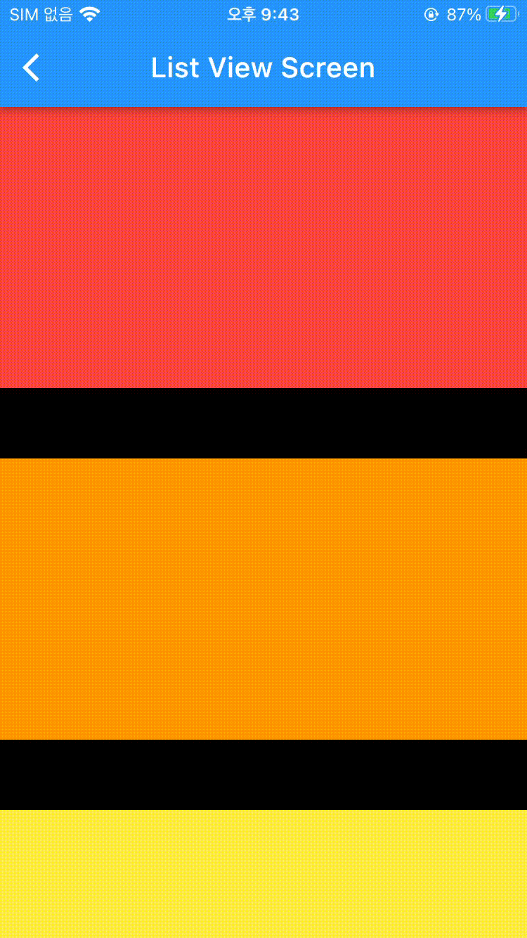
seperate: 사이사이에 view 생성
ListView.separated(
  itemBuilder: (context, index){
    return RenderColorContainer(
      // 랜더하고 싶은 뷰
      color: rainbowColors[index % rainbowColors.length]);
    },
  separatorBuilder: (context, index){
    return RenderColorContainer(
      // 사이사이에 렌더하고 싶은 뷰
      color: Colors.black,
      height: 50,
      );
    }, itemCount: 100);
}
ListTile
ListTile(
  tileColor: Colors.white,
  selectedTileColor: lightColor,
  selectedColor: Colors.black,
  selected: e == '서울',
  onTap: () {},
  title: Text(e),
), // (1)

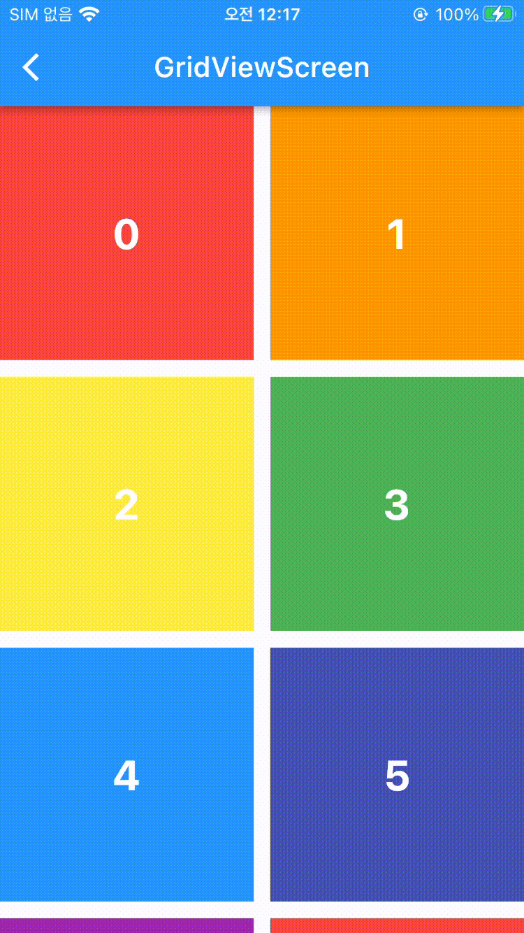
Grid View
가로로 여러 개의 View를 표시할 수 있음.
Count
뷰를 한 번에 다 그려낸다는 단점이 있음.
에 가로로 표시될 뷰의 갯수를 넣어줄 수 있음. 전체 코드 👇GridView.count(
crossAxisCount: 2, // 가로 뷰 갯수
crossAxisSpacing: 12.0, // 가로 간격
mainAxisSpacing: 12.0, // 가로 간격
children: numbers
.map(
(e) => RenderColorContainer(
color: rainbowColors[e % rainbowColors.length],
index: e,
),
).toList(),
);
AxisSpacing
- crossAxisSpacing : 가로로 간격 나눔 (float)
- mainAxisSpacing : 세로로 간격 나눔 (float)
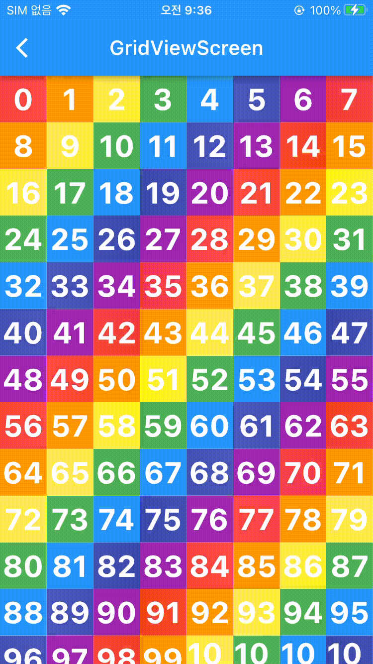
builder: 화면에 보이는 갯수만큼
(delegate)CrossAxisCount: 지정한 갯수 기준
가로로 지정한 갯수만큼 뷰를 보여줌.
GridView.builder(
  gridDelegate: SliverGridDelegateWithFixedCrossAxisCount(
      crossAxisCount: 2 // 가로로 뷰 갯수 고정함
  ),
  itemBuilder:(context, index) {
    return RenderColorContainer(
      color: rainbowColors[index % rainbowColors.length],
      index: index,
    );
  },
);
(delegate)CrossAxisEntent: 최대 사이즈 기준
지정한 최대 크기 기준으로 그 최대 크기를 넘지 않는 선에서 가로로 최대로 뷰 갯수를 채움.
gridDelegate: SliverGridDelegateWithMaxCrossAxisExtent(
  maxCrossAxisExtent: 50, // 최대 크기가 50이 되는 한도 내에서 가로로 꽉 채움.
)
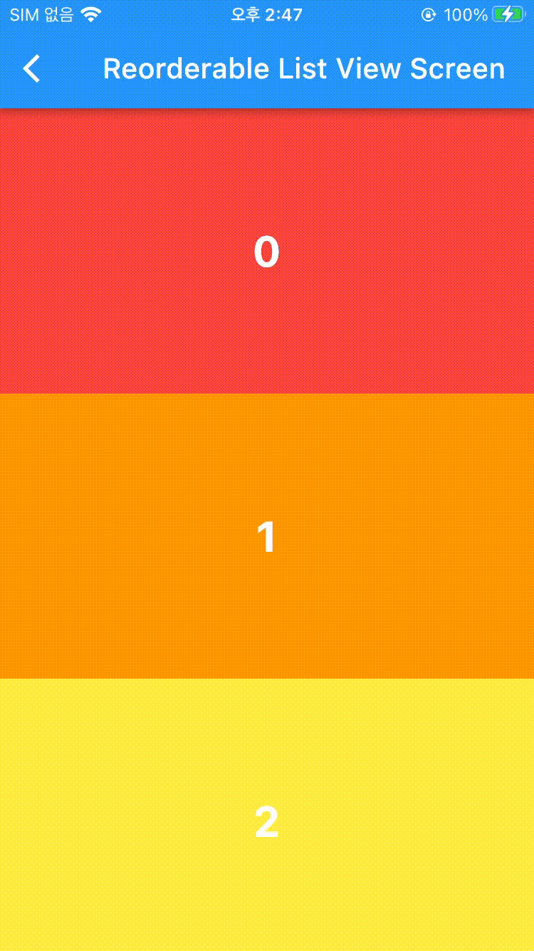
Reorderable List View
재정렬 가능한 List View. builder를 통한 구현 👇
ReorderableListView.builder(
  itemBuilder: (context, index) {
    return RenderColorContainer(
        key: Key(
          index.toString()),
          color: rainbowColors[renderNumbers[index] % rainbowColors.length],
          index: renderNumbers[index]);// (1)!
  },
  itemCount: renderNumbers.length,
  onReorder: (int oldIndex, int newIndex) {
    setState(() {
      if (oldIndex < newIndex) {
        newIndex -= 1;
      } // (2)!
      final item = renderNumbers.removeAt(oldIndex);
      renderNumbers.insert(newIndex, item);
    });
  },
)
- index number가 이동하면 이동한 위치의 새로운 index number(3 > 5로 옮기고 나면 3자리에 3이 그대로 들어옴)가 됨, 그러나 해당 index에 있던 renderNumber는 바뀌게 됨(3자리에 있던 3을 5로 보내게 되면 3자리에 4가 들어옴).
즉, 3에 있던 renderNumber를 5로 보내면 여전히 3번째 인덱스를 봤을 때 3번째 인덱스로 보이지만 해당하는 인덱스에는 renderNumber의 다음 인덱스가 그 인덱스 번호를 차지하게 됨. - oldIndex와 newIndex 모두 이동이 되기 전에 산정됨.
[red, orange, yellow]
[0, 1, 2]
red를 yellow 다음으로 옮기고 싶을 경우
oldIndex는 0으로 newIndex는 3으로 지정이 됨.
[orange, yellow, red]
옮기고 난 후의 Red의 index는 2번이 됨.
따라서 낮은 인덱스를 높은 인덱스로 옮길 때는 newIndex에 -1을 해줘야함.
[red, orange, yellow]
yellow를 맨 앞으로 옮기고 싶을 경우.
yellow : 2 oldIndex -> 0 newIndex
[yellow, red, orange]
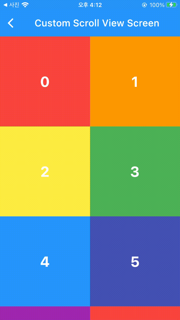
Custom Scroll View
Grid View와 List View를 연속해서 써야할 일이 있거나할 때 Custom해서 사용자가 정의한 방식대로 동작하는 Scroll View.
Sliver List
@override
Widget build(BuildContext context) {
  return Scaffold(
    body: CustomScrollView(
      slivers: [
        renderSliverAppBar(),
        renderBuilderSliverList(),
      ],
    ),
  );
}

SliverList renderBuilderSliverList() {
  return SliverList(
    delegate: SliverChildBuilderDelegate( // delegate 지정해줘야함.
    (context, index) {
        return RenderColorContainer(
            index: index,
            color: rainbowColors[index % rainbowColors.length]);
      },// (1)!
      childCount: 100, // itemCount와 같음, view 최대 갯수 지정
    ),
  );
}
- ListView에서는 itemBuilder의 파라미터로 들어갔지만 여기에선 Delegate에 함수 형태로 들어가게 됨.
Sliver Grid
Sliver List에서 gridDelegate가 추가됨.
Widget build(BuildContext context) {
  return Scaffold(
    body: CustomScrollView(
      slivers: [
        renderSliverAppBar(),
        renderSliverGrid(),
      ],
    ),
  );
}

SliverGrid renderSliverGrid() {
  return SliverGrid(
    delegate: SliverChildBuilderDelegate(
          (context, index) {
        return RenderColorContainer(
            index: index,
            color: rainbowColors[index % rainbowColors.length]);
      },
      childCount: 100, // itemCount와 유사함
    ),
    gridDelegate:
    SliverGridDelegateWithFixedCrossAxisCount(crossAxisCount: 2),
  ); // (1)!
}
- Grid View에서 추가하는 Delegate에 Sliver만 붙임.
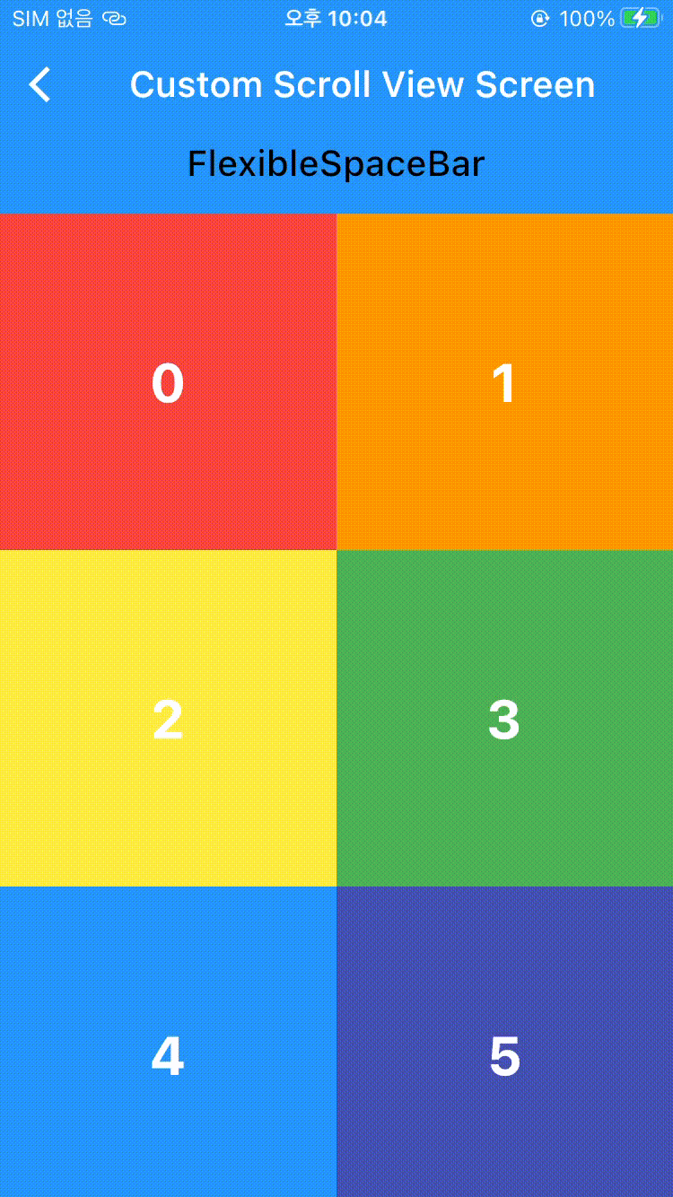
Sliver Appbar
커스텀 Appbar, Default 설정으로 자동으로 없어지게 끔 되어 있음.
SliverAppBar(
  floating: true,
  snap: false,// (1)!

  stretch: true,
  pinned: false, // (2)!

  expandedHeight: 400, // 최대로 늘어나는 사이즈
  collapsedHeight: 100, // 접혔을 때 사이즈

  flexibleSpace: FlexibleSpaceBar(
    background: Image.asset(
      'asset/img/image_1.jpeg',
      fit: BoxFit.cover
    ),
    title: Text(
      'FlexibleSpaceBar',
      style: TextStyle(color: Colors.black),
    ),
  ), // (3)!
  title: Text('Custom Scroll View Screen'),
);
-
floating : true로 하면위로 잠깐 스크롤하면 AppBar 나타남.
snap : flaoting True 상태로 사용, true시 조금만 스크롤해도 AppBar 움직임. -
stretch : 맨 위에서 한계 이상으로 스크롤 했을 때 Scaffold 대신 Appbar가 차지함.
pinned : true로 하면 위에 AppBar 고정됨.고정 전

고정 후
늘어났을 때 보여지는 공간
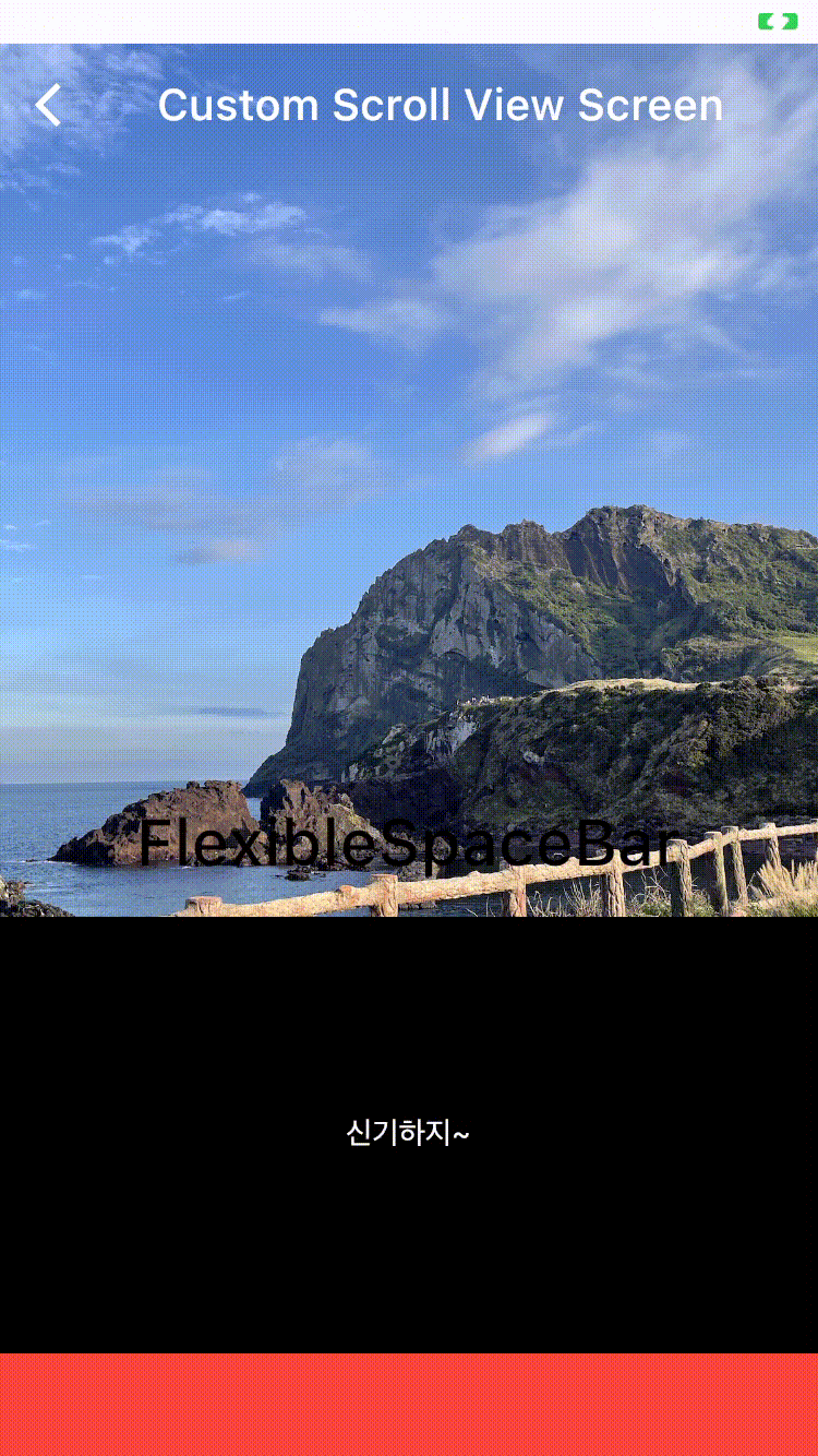
Sliver Header
Sliver Header는 Custom Scroll View 사이사이에 Header를 넣을 수 있는 기능임.
SliverPersistentHeader(
  pinned: true, // 상단에 고정함
  // Delegate에서 실제 동작 구현
  //(1)!
  delegate: _SliverFixedHeaderDelegate(
    child: Container(
        color: Colors.black,
        child: Center(
          child: Text(
            '신기하지~',
            style: TextStyle(
              color: Colors.white,
            ),
          ),
        ),
      ),
      maxHeight: 200,
      minHeigt: 10),
);
동작 화면
class _SliverFixedHeaderDelegate extends SliverPersistentHeaderDelegate {
  final Widget child;
  final double maxHeight;
  final double minHeigt;

  _SliverFixedHeaderDelegate({
    required this.child,
    required this.maxHeight,
    required this.minHeigt,
  });

  // 실제로 build 하는 부분
  @override
  Widget build(
      BuildContext context, double shrinkOffset, bool overlapsContent) {
    return SizedBox.expand(
      child: child,
    );
  }

  // 최대 높이
  @override
  double get maxExtent => maxHeight;

  // 최소 높이
  @override
  double get minExtent => minHeigt;

  // oldDelegate - build가 실행이 됐을 때 이전 Delegate
  // return 값이 true면 재빌드 함
  @override
  bool shouldRebuild(_SliverFixedHeaderDelegate oldDelegate) {
    return oldDelegate.minHeigt != minHeigt ||
        oldDelegate.maxHeight != maxHeight ||
        oldDelegate.child != child;
  }
}
Sliver To Box Adaptor
slivers = [] 안에는 Sliver 위젯들 밖에 들어올 수 없지만 Sliver To Box Adaptor를 사용하면 Card나 Container 등의 위젯이 들어올 수 있음.
SliverToBoxAdapter(
  child: Container(
    color: Colors.white,
    height: 200,
    child: Column(
      mainAxisAlignment: MainAxisAlignment.center,
      children: [
        Text(
          '이건 되지롱 !!!!!',
          style: TextStyle(fontSize: 18, fontWeight: FontWeight.w700),
          textAlign: TextAlign.center,

        ),
      ],
    ),
  ),
);
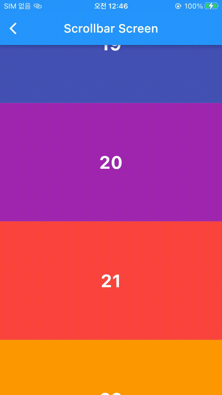
Scrollbar
Scroll 가능한 위젯을 Widget(Scrollbar)로 감싸줌. 기본적으로 존재하지 않는 스크롤 바가 생김.
Scrollbar( // 동작 화면 (1)
  child: SingleChildScrollView(
    child: Column(
      children: renderNumbers
          .map(
            (e) => RenderColorContainer(
              index: e,
              color: rainbowColors[e % rainbowColors.length],
            ),
          )
          .toList(),
    ),
  ),
),
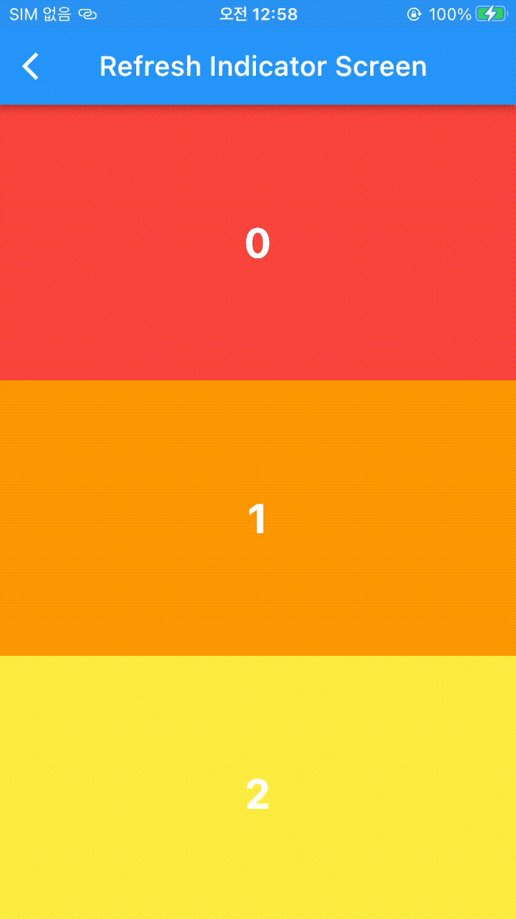
Refresh Indicator
Scrollable View의 최상단에서 아래로 당겼을 때 loading 창이 구현됨.
ScrollBar와 마찬가지로 Scrollable 위젯을 Refresh Indicator로 감싸고 onRefresh로 refresh 실행시 동작할 함수를 구현함.
RefreshIndicator(
  // refresh 실행하면 실행될 함수
    onRefresh: () async {
    await Future.delayed(Duration(seconds: 2));
  },
  child: ListView(
    children: renderNumbers.map(
      (e) => RenderColorContainer(
        index: e,
        color: rainbowColors[e % rainbowColors.length],
      ),
    ).toList(),
  ),
);// 실행 화면 : (1)